
The Complete 2021 Guide to the Benchmarker
Martin Saunders, May 4, 2021
The Benchmarker - Executive Summary
Busy? Find a summary of the top 3 things to do with the benchmarker on 1 page here!
What is the Benchmarker?
The Benchmarker is a free, ground-breaking insights tool that allows advertisers to understand their Amazon PPC performance in context.
The Benchmarker allows you to analyze and compare your ad performance on country, category, ad-format, and individual-product levels. The newest version of the tool includes ~20,000 Amazon product subcategories and an ASIN performance deep-dive for your top 100 products!
By benchmarking, you can identify strengths and weaknesses relative to competitors and understand what you should focus on improving.
In this complete guide, we will explain each section of the Benchmarker report so that you will be able to interpret and act on its data-driven insights.
Looking for more Amazon PPC background, data, and insights?
Whether you’re interested in a high-level analysis of Amazon Advertising, a detailed look at recent marketplace trends, or a deep dive into the nuances of specific product categories, our 2022 Amazon Advertising Benchmark Report can help you gain insight into the Amazon PPC landscape.
The report is based on a comprehensive analysis of over 2 million Sponsored Products campaigns and you can download it for free today.
The Summary Section

At the very top of your report you will find the following report parameters:
the month
the marketplace
your overall score
links to share your performance certificate on social media.
The month of performance data that has been analyzed in the report is shown in the bottom left corner of the summary section. The Benchmarker automatically analyzes your last month’s performance every 30 days.
So, for example, if you receive your report on April 15, it will contain an analysis based on data from the entire month of March. Because you receive your report every 30 days, your next report will be generated on May 15, and it will contain an analysis based on data from the whole month of April.
By clicking on the arrow buttons in the bottom left-hand corner of the summary section, you can navigate to older reports to compare your performance over time.
Tip: if you'd like to change the date that you receive your report, simply request a new Benchmarker [Beta] report for the same marketplace and category on your preferred day—this will override your original request.
The flag indicates the marketplace that the Benchmarker [Beta] is reporting on. If you would like a report for a different marketplace, you will need to request a new Benchmarker report.
On the far-right side of the summary section is a badge that grades your overall performance versus your competitors, the badge levels are as follows:
platinum: top 10%: high growth potential
gold: top 20%: high growth potential
silver: top 50%: very high growth potential
bronze: bottom 50%: very high growth potential.
If you are running more than one type of ad, each ad type makes up a proportional percentage of your score. So if 50% of your ad spend goes to Sponsored Products and 50% goes to Sponsored Brands, then each ad type will account for half of your overall score.
For example, if your Sponsored Products performance is in the top 20% and your Sponsored Brands performance is in the top 40%—and both have a 50% investment share—then your overall account score will be in the top 30%.
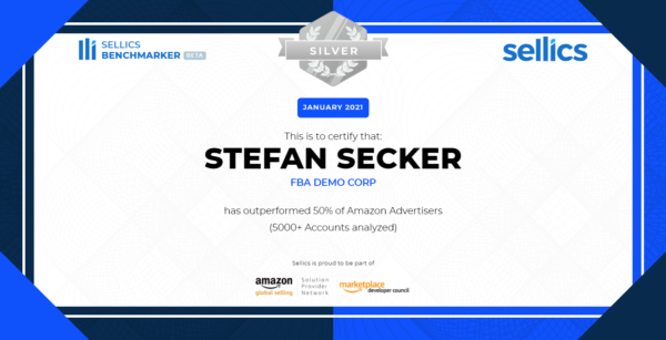
By clicking on the links beneath the “Share Certificate” section of your performance badge, you can generate a PPC performance certificate and share it with your personal and professional networks.
To improve your score, implement the steps outlined in the Product Analysis section.
The Benchmarker - Executive Summary
Busy? Find a summary of the top 3 things to do with the benchmarker on 1 page here!
Performance Funnel and Return on Investment
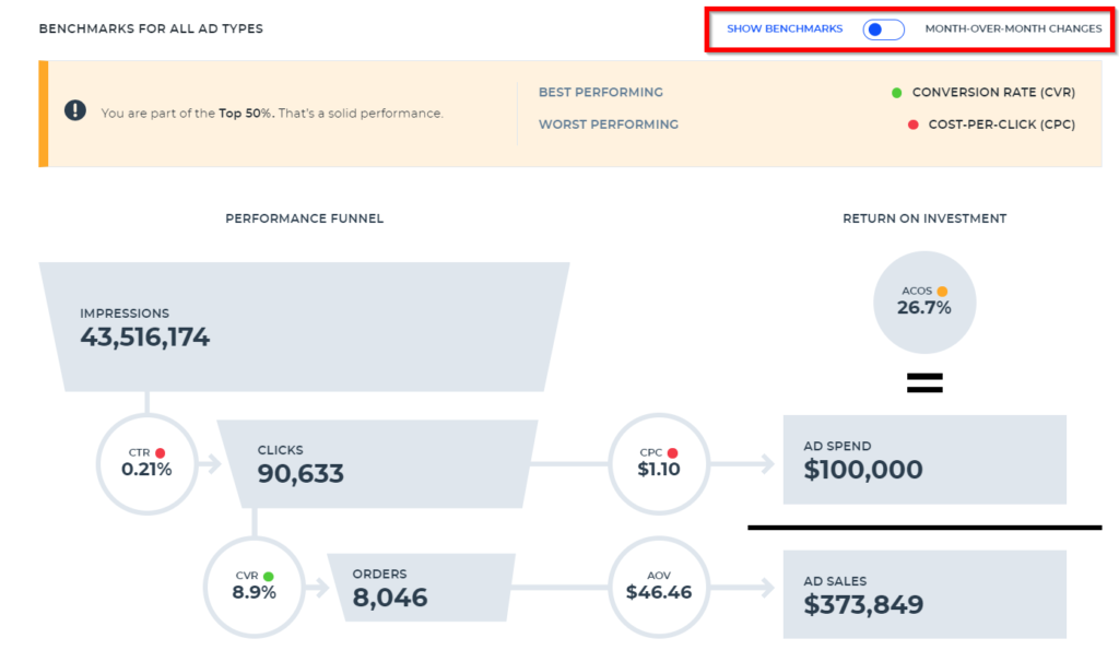
The next section provides a top-to-bottom review of your account performance, allowing you to easily visualize all of the metrics that go into your most important key performance indicators (KPIs). The right side of the graphic displays your return on investment.
Tip: click the “SHOW BENCHMARKS” / “MONTH-OVER-MONTH CHANGES” button to compare your KPIs to benchmarks or your previous month’s performance in the summary box and performance funnel.
Please find the explanations of the metrics in the following table.
METRIC | DEFINITION | WHY IT’S IMPORTANT |
|---|---|---|
Impressions | The number of people who see your ads. | As long as your targeting is optimized, the more people to see your ad, the higher the chances that someone will buy your product. |
CTR (click-through rate) | The percentage of people who clicked on your ad out of everyone who saw it (calculated as clicks ÷ impressions). | A low CTR normally indicates either poor targeting (not relevant to the shopper) or poor image/video assets (i.e. bad quality). |
Clicks | The number of people who clicked on your ad. | Clicks represent customer interest. |
CVR (conversion rate) | The percentage of people who made a purchase out of everyone who clicked on your ad and visited your product detail page (calculated as orders ÷ clicks). | This is an indicator of how persuasive your offer and product page are. |
Orders | The number of times that a shopper has purchased your product. | Orders create revenue. |
CPC (cost per click) | What you pay per click—the true price of the ad auction. Your CPC depends on your bid, the competition, and your quality-score. Because the bid auctions are second-price auctions, where you pay $0.01 above what would be required to beat the bidder behind you, your CPC will always be lower than the actual bid. | Your overall CPC will determine if your ads are profitable. |
AOV (average order value) | The average revenue per order. | The higher the average order value, the greater your overall revenue. |
Ad costs | The total ad investment (calculated as CPC × number of clicks). | If your ad costs are too high compared to the revenue you generate, your ad campaigns will not be profitable. |
Ad sales | The total revenue driven by ads (calculated as orders × AOV). | The absolute volume of revenue that is generated via ads. |
ACoS (advertising cost of sales) | The percentage of every ad-generated revenue dollar that is spent on advertising. ACoS is calculated as ad costs ÷ ad sales. | ACoS is an indicator of the efficiency of your Amazon advertising campaigns. |
The Benchmarker - Executive Summary
Busy? Find a summary of the top 3 things to do with the benchmarker on 1 page here!
The Impact Driver Analysis Section
The Impact Driver Analysis section gives Benchmarker users a snapshot of the products with the highest impact (positive and negative) on the KPIs that matter most, such as ad sales, ACoS, CPC, etc. With the Impact Driver Analysis, Sellics customers can quickly identify top gainers and losers in their product category month-over-month. This analysis combined with quick decision-making is sure to be a recipe for advertising success.
The Impact Driver Analysis will answer:
Why did my Ad Sales increase/decrease?
Which products caused a drop/increase in ACoS, ad sales?
Where did my CPC increase over last month?
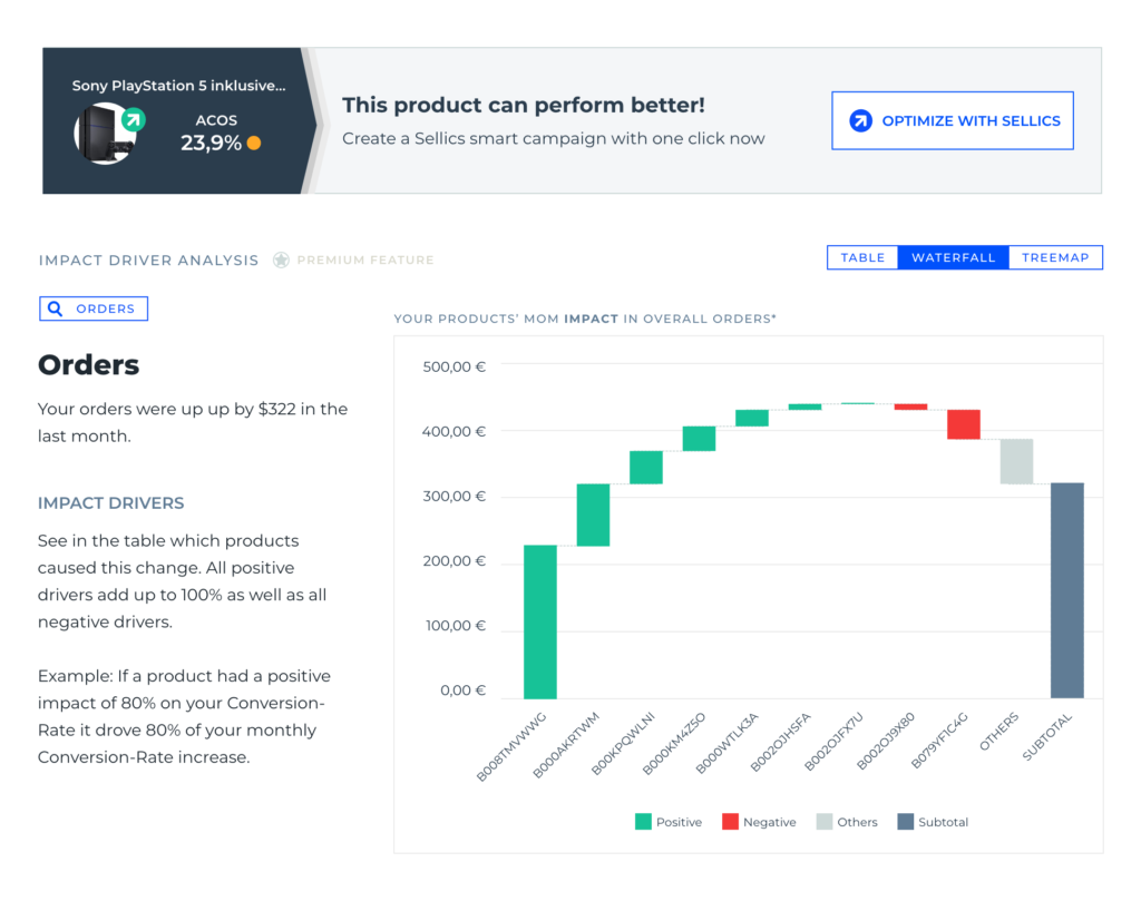
The new “Impact Driver Analysis” enables you to see at a glance which products are contributing (positively and negatively) the most to your month-over-month performance changes for all their main KPIs incl. ad spend and ACoS.
The feature is a new section in the Benchmarker. You can view 3 types of charts, namely
Waterfall
Treemap
Product table
which will all analyze the “impact drivers”. These charts give quick intel on products that are the top winners and losers for each KPI.
In general, the Impact Driver Analysis section can help you identify top gainers and losers across all products.
The Waterfall Chart
The waterfall chart is designed to visualize the top 5 gainers and top 5 losers in a single chart. It will automatically pick the top 5 gainers and losers each.
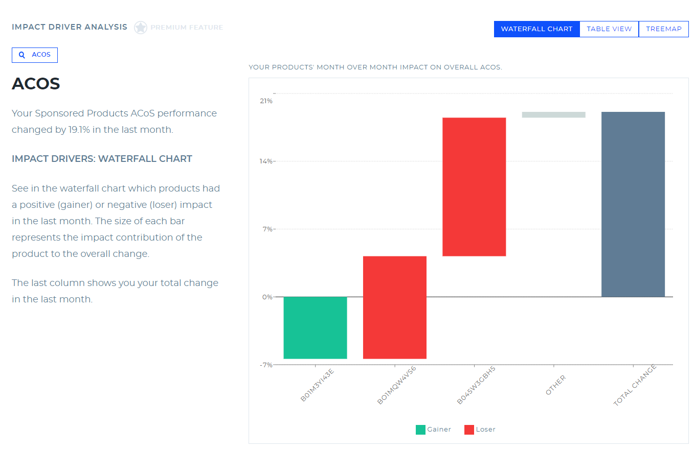
Select the impact metrics you want to track. We recommend ACoS or ad sales for starters.
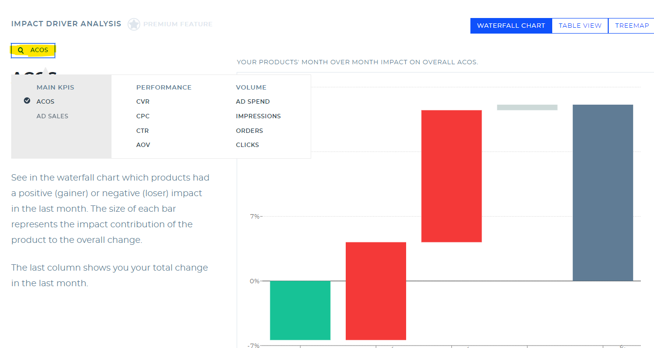
What does ‘Others' mean in the waterfall or treemap chart?
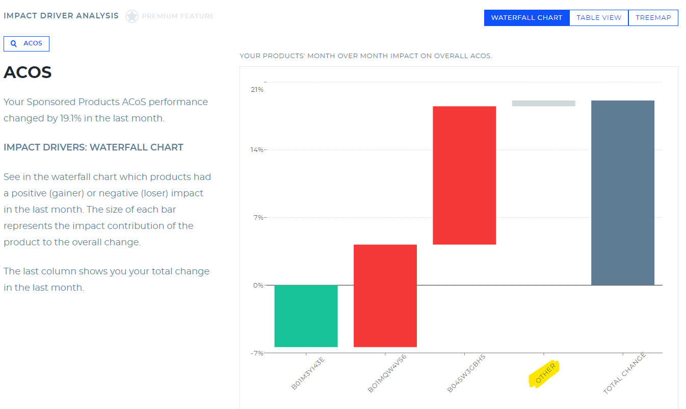
All edge cases, outliers, new products added, or effectively smaller impact products are currently added in the “other”.It includes all factors which cannot be connected to a dedicated product Month-over-Month, mostly New products, Removed products, Products with 0’s in KPIs (e.g. 0 orders, no relative value live CvR available)
Additionally: The waterfall chart weights changed by Ad Spend, which is only an approximation for a waterfall chart for relative values. There will normally be a gap. The size of the bars of the products among each other with regards to impact is correct.
The Treemap
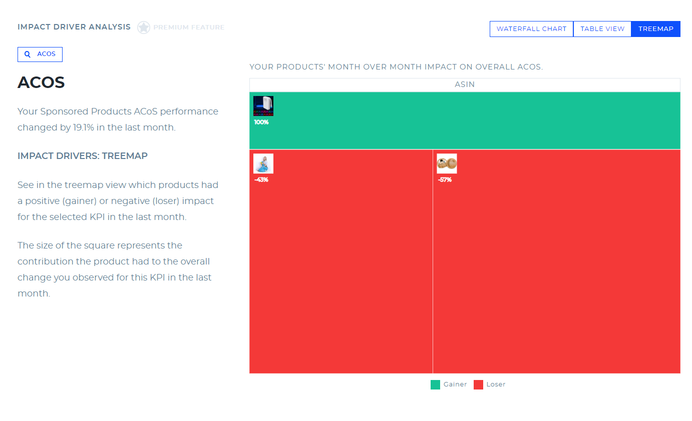
See in the treemap view which products had a positive (gainer) or negative (loser) impact for the selected KPI in the last month.
Seek out the largest rectangular values (or the largest collected group of rectangles) and look out for significant color variations.
The Table view
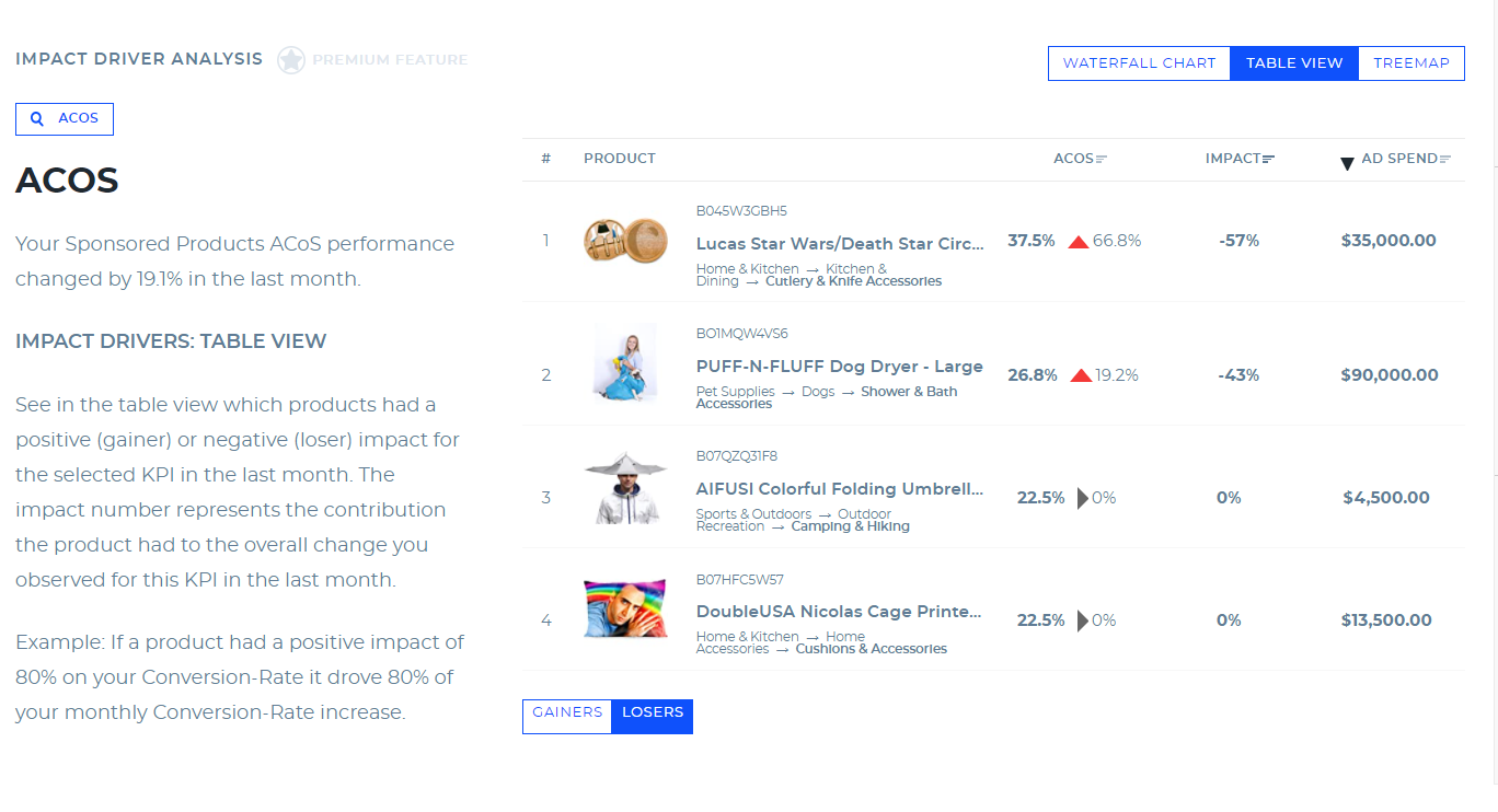
See in the table view which products had a positive (gainer) or negative (loser) impact for the selected KPI in the last month. The impact number represents the contribution the product had to the overall change you observed for this KPI in the last month.
How are gainers and losers defined?

Any product with a positive customer outcome is a gainer. Any product with a negative customer outcome is a loser. Logic is similar across ACoS, CTR, Ad Sales, Ad spend, CPC.
The Impact Driver Analysis is a premium feature of the Benchmarker and is available only to Sellics customers with Advisor or Managed Services plans. Get access inside Sellics or by signing up here.
If you’re not a Sellics customer (yet), use the book a call button in the free version of the Benchmarker report to unlock your access to the Impact Driver Analysis insights over the phone.
Important: because the Impact Driver Analysis requires month-over-month data, it is only available after your second Benchmarker report. Currently, the Impact Driver Analysis analyzes Sponsored Products.
The Performance Matrix Section
The Performance Matrix provides a visualization of your top 10 products by ad spend, giving you quick insight into which products performed well last month and which have room for improvement.
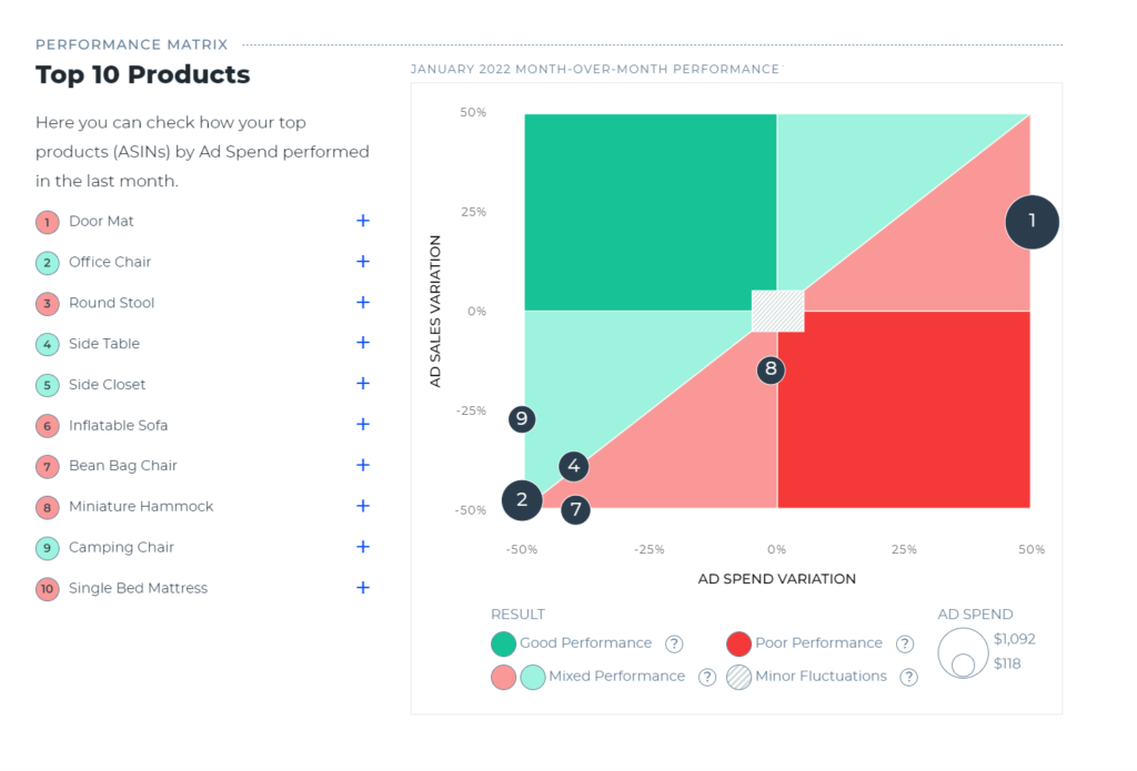
The Performance Matrix plots ad sales variation against ad spend variation, in both cases this is expressed as a percentage compared with the previous month. As the matrix is divided into quadrants, you can instantly see which products have increasing or decreasing ad sales and ad spend. For example, any products in the top right quadrant have both increasing ad sales and increasing ad spend. In our example, this is products 1 (Door Mat) and 3 (Round Stool).
The color-coding of the Performance Matrix' sections is based on advertising profitability:
Dark green: Ad sales have increased while ad spend has dropped—your ads are becoming much more profitable.
Light green: Ad sales and ad spend have both either decreased or increased, but the trend for ad sales is better—your ads are becoming slightly more profitable.
Light red: Ad sales and ad spend have both either decreased or increased, but the trend for ad sales is worse—your ads are becoming slightly less profitable.
Dark red: Ad sales have decreased while ad spend has gone up—your ads are becoming much less profitable.
In addition to the quick overview, the Performance Matrix also lets you analyze a specific product more closely, either by clicking the plus symbol in the left-hand list, or by hovering over the bubble for a detailed tooltip.
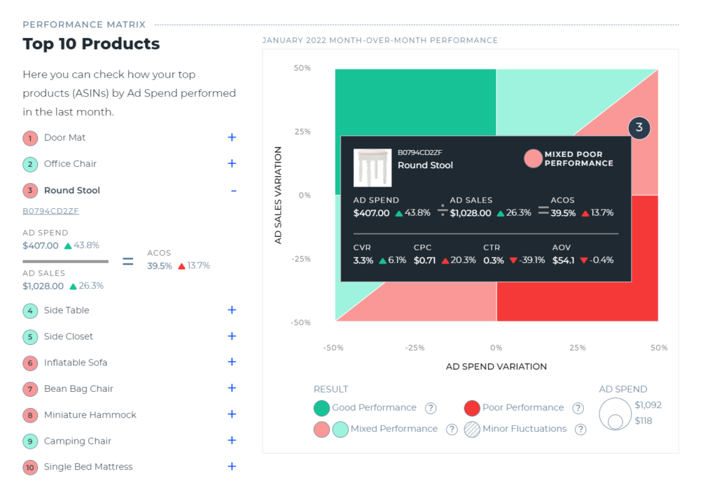
Expanding the information in the list shows you the precise numbers (and variation) for ad spend and ad sales, and shows you how these have impacted that product's ACoS.
The tooltip goes a step further by including the metrics available in the other sections of the Benchmarker: conversion rate, cost per click, click-through rate and average order value. This helps you see in detail what has driven the changes in that product's performance.
In the example above, where we have expanded the performance information for the “Round Stool”, we can draw the following conclusions:
The improved ad sales (+26.3%) have been helped by the 6.1% increase in conversion rate.
The rise in ad spend (+43.8%) is largely driven by the 20.3% increase in CPC.
As ad spend has risen more than ad sales, the ACoS has also gone up (by 13.7%), which is why this product appears in the light red section of the Performance Matrix.
You can then see how these findings align with your strategy. If you have made optimizations to your product listing to improve your conversion rate, and bid more aggressively to drive ad sales, then the Performance Matrix shows you that this strategy has proven effective.
Note: Because the Performance Matrix shows month-over-month trends, it is only available from your second Benchmarker report onwards. Currently, the Performance Matrix analyzes Sponsored Products.
The Product Analysis Section
In the Product Analysis section, you can easily identify specific products whose ads are in need of optimization and then take steps to improve the KPIs for those products.
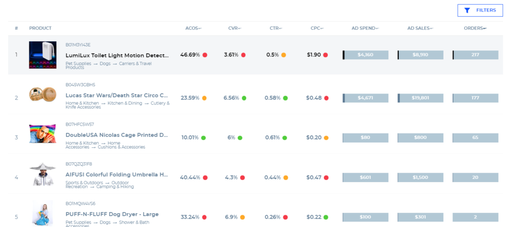
Next to each KPI there is a circle that is either green, yellow, or red. These colors indicate where you stand in the performance distribution relative to your peers:
green: you are in the top 40% = you’re doing well
yellow: you are in the middle 20% = there’s room for improvement
red: you are in the bottom 40% = you’re doing poorly.
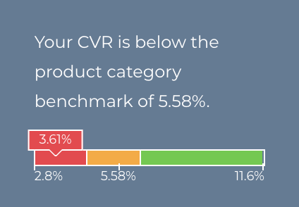
When you hover over any of the KPI scores, a bar chart displaying the performance distribution with the same color coding will display.
This allows you to see in more detail how much room for improvement there is and what are reasonable target values for your optimization efforts.
The number beneath the yellow section of the bar chart is the median. In the example above, the subcategory median conversion rate (CVR) is 5.58%. That means 50% of the advertisers in this subcategory have a higher conversion rate and 50% have a lower conversion rate. Ideally, you should at least achieve this target value by optimizing your product and ads.
The figure on the left end of the distribution (in this example 2.8%) means 20% of the advertisers in this subcategory have a lower value than 2.8%.
Similarly, the figure on the right (in this example 11.6%) means 20% have a higher value than 11.6%.
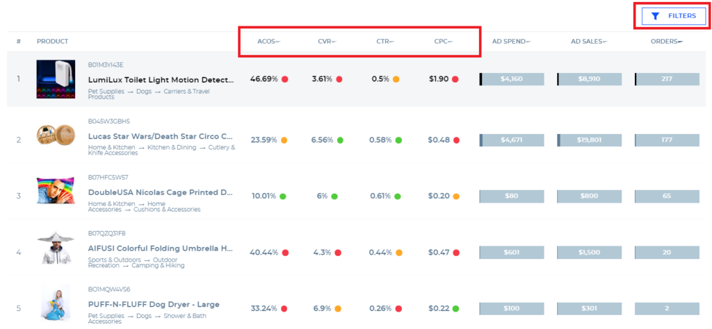
The conversion rate (CVR) for this product’s ads is 3.61%, meaning that it is in the lowest 40% of sellers in this subcategory—there is a lot of room for improvement.
Summary: How to improve your KPIs
To start optimizing, follow the steps outlined below:
Use the “FILTERS” button above the far-right column to filter for products with a relevant (minimum) volume of ad spend.
Click on any of the KPIs in the first row to easily sort scores to identify high-impact opportunities for optimization.
Implement solutions outlined in the table below to improve your KPIs.
KPI | WHY IT’S IMPORTANT | HOW YOU CAN IMPROVE WITH SELLICS |
|---|---|---|
Cost-per-Click (CPC) | If CPC is too high, you are overpaying, resulting in a bad ACoS. If it’s too low you’re missing sales. | – Optimize your bids – Apply ready-to-use best-practice rule sets in Sellics to automatically optimize bids towards your goal (target ACoS). – Learn more |
Click-through-Rate (CTR) | If your CTR is too low, you’re reaching fewer customers than you could with your ads. | – Make your ad more appealing: compare product images between high and low performing products – Make your targeting more relevant: Use Sellics’ keyword research tool and automatic keyword harvesting rules to identify new relevant targets and to increase your reach. – Learn more |
conversion-Rate (CVR) | If your CVR is too low you’re losing potential customers on your product page resulting in missed sales. | – Improve the persuasiveness of your product listing. – Use Sellics’ Listing Optimization feature to quickly identify weak spots in individual product content across your whole portfolio. Then craft converting listings with the Sellics listing creation tool (and streamline this process across your portfolio). – Use the Sellics reviews tool to monitor and manage new questions and reviews for your products. – Learn more |
Advertising cost of sales (ACoS) | If your ACoS is too high, your ads are not efficient, i.e. you make less profit or even lose money. | – If you improve your CPC, CTR, and CVR by implementing the solutions above— e.g., bidding automation, keyword harvesting, listing optimization, and review management—this will also improve your ACoS. – Additionally, a very effective way to reduce your ACoS is applying the ready-to-use best-practice rules for negative keywords automation in Sellics. Negative keywords reduce your ad waste and thereby improve your profitability. |
How to improve your cost per click (CPC) with Sellics
Step 1: log into / sign up for Sellics
Log into your Sellics account to start optimizing.
Step 2: set your target ACoS
Step 3: set up bidding automation
For more information please see this article.
How to improve your click-through rate (CTR) with Sellics
Step 1: log into / sign up for Sellics
log into your Sellics account to start optimizing.
Step 2: identify low-quality images
In your Benchmarker report, you can easily compare the images of products that have a high and low CTR to identify weak spots to improve.
To improve your images, ensure they:
meet Amazon’s image requirements
have good lighting
show the product so that it covers at least 85% of the space
use angle and perspective
show important details about your product.
Step 3: Research more relevant keywords
For the products that have a poor CTR, use Sellics’ keyword research tool to find relevant keywords and add them to your campaigns.
To access the keyword research tool, click on the “Content & SEO” section of the menu on the left-hand side of the screen. Then, enter a keyword or competitor ASIN into the search box and hit the search icon.
The results will show a list of suggested keywords and their search volume.
Next, click on the “ + “ button next to any of the keywords to add them to your keyword list. Finally, copy or export your list and then add the keywords to your relevant campaigns.
For more information please see this article.
Step 4: set up keyword harvesting automation
What is keyword harvesting?
How to set up keyword harvesting automation?
For more information please see this article.
How to improve your conversion rate (CVR) with Sellics
A low conversion rate can indicate one or more of the following problems:
poor ad targeting
poor listing/content optimization
not enough positive reviews
overpriced product
bad product.
Here, we’ll focus on how you can improve your ad targeting and product listings (content and reviews).
Step 1: log into / sign up for Sellics
Log into your Sellics account to start optimizing.
Step 2: optimize your listings
Use Sellics’ Listing Optimization tool to identify weak spots in individual product content and across your whole portfolio
To access the Listing Optimization tool, click on the “Content & SEO” section of the menu on the left-hand side of the page. Then click on the “Listing and Optimization” section.
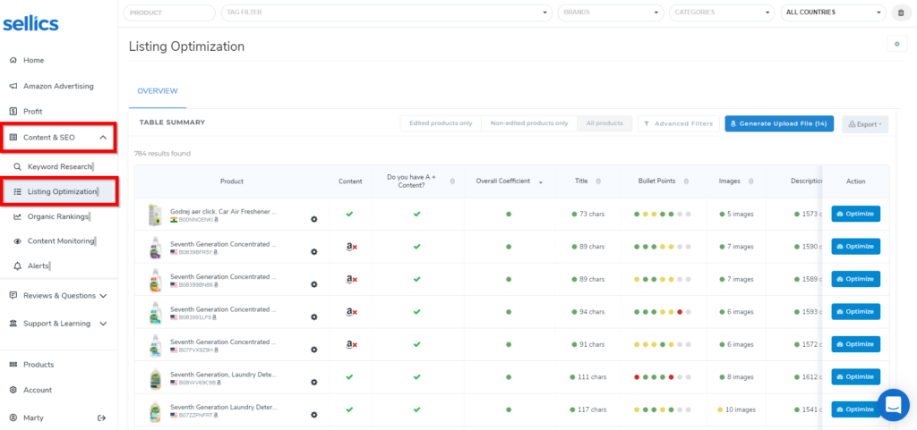
There you can easily get an overview of the content in your listings and identify areas that need to be improved.
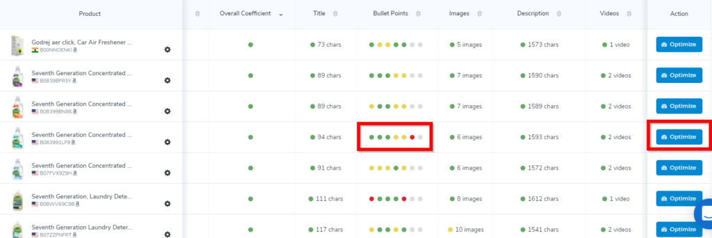
For example, the yellow and red dots in the “Bullet Points” column mean that the product description bullet points either have too many or too few characters.
To fix this, click on the optimize tab, and write new bullet points. Repeat this process with the other elements of your content to craft converting listings.
For more information please see this article.
Step 3: manage customer questions and reviews
To access the questions and reviews tool, click on the “Reviews & Questions” section of the menu on the left-hand side of the page. Then click on the “Questions” or “Reviews” section of the drop-down menu.
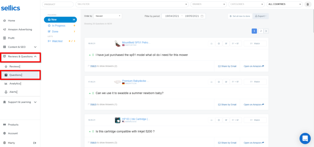
Use the questions tool in particular to provide timely responses to the inquiries of potential customers. The question response gives you more space to communicate product details that aren’t covered in the key listing elements.
You can also add questions on your own product listings to anticipate customer questions and respond to neutral and negative reviews.
For more information please see this article.
Step 4: Improve your targeting
For instructions on how to use the Sellics keywords research tool, see above.
For instructions on how to use the Sellics best-practice rule sets for negative keyword automation and keyword harvesting automation, see above.
How to optimize your ACoS with Sellics
ACoS is determined by CPC, CTR, and CVR, and other non-ad-related factors like average order value. By implementing the solutions above to improve your
you will also improve your ACoS.
Automate negative keywords
Sellics keyword automation rules also enable you to automate adding negative keywords. Negative keywords are reducing your ad waste and thereby improve your ACoS significantly.
Log into your Sellics account to start optimizing.
Autopilot, Sellics’ fully automated advertising solution, allows you to harness the power of artificial intelligence to optimize your advertisements on Amazon.
Autopilot’s AI-based algorithm takes into account keyword clustering, revenue, and sales forecasting, considering seasonality and other factors to detect patterns that humans can’t.
It will automate your bidding, keyword harvesting, and optimize your ACoS, saving you a maximum amount of time while boosting performance.
The numbers speak for themselves: over 91% of advertisers hit their advertising goals within the first three months using Autopilot. Don’t fall behind your competition.
The Benchmarker - Executive Summary
Busy? Find a summary of the top 3 things to do with the benchmarker on 1 page here!
Account Structure
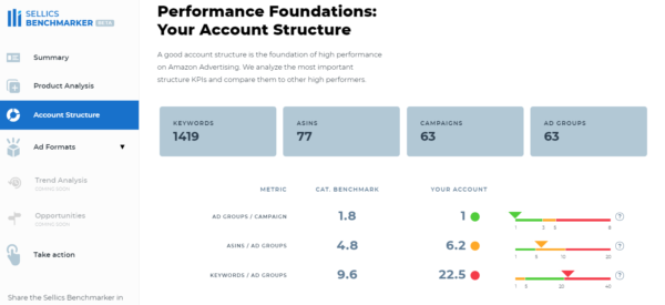
This section of the Benchmarker [Beta] report helps you understand how your account structure compares to the best practices.
Ad groups/Campaign
Your score is the average number of ad groups you have in your campaigns. The ad group must have at least 1 impression to count.
Having fewer ad groups per campaign will give you more control over your budget, as the budget is set on campaign level. This will avoid cases where a subset of your ad groups is using most of your budget until it runs out, leaving other ad groups with few impressions. Having control makes your account quicker and easier to optimize.
For detailed blueprints on how to structure your campaigns, check out our comprehensive guides:
Advertised ASINs/Ad Group
Your score is the average number of advertised ASINs you have in every ad group. Only ASINs with at least one impression are counted.
For all of the ASINs that are grouped together, the following characteristics should be very similar:
search intent (keywords)
profit margins.
If the grouped ASINs do not have these characteristics in common, it will be difficult to optimize targets and bids or even to interpret results. This in turn will make it difficult to design a high-performing campaign.
Your ability to group advertised ASINs will depend on the size and diversity of your product portfolio. For most advertisers, 1 to 10 ASINs per ad group will be ideal.
Keywords/Ad group
This score shows the average number of keywords per ad group in your account (other targets, e.g. ASINs, are not included currently). Only unique keywords with at least 1 impression per ad group are included.
Advertisers with less than 5 keywords usually aren’t bidding on all of the keywords that could help them reach potential customers. Advertisers who have more than 20 targets lose the ability to quickly and easily optimize their target bids because clicks are widely distributed.
For advertisers with less than 10k/month in ad spend, we recommend between 5 and 20 targets per ad group. For advertisers with more than 10k/month in ad spend 20+ targets can work well.
Pro tip: With the best-practice rule sets in Sellics Advertising, you can automate target harvesting and optimization, negative keyword migration, and bid optimization.

The Benchmarker - Executive Summary
Busy? Find a summary of the top 3 things to do with the benchmarker on 1 page here!
Ad Formats
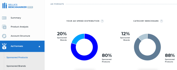
This section allows you to understand how much budget you are investing in different Amazon Sponsored Ads formats compared to other sellers in your category.
If your ad portfolio is less diverse than other sellers in your marketplace and category, it can make sense to diversify and add different ad formats to your portfolio - especially, if your campaigns are performing well and you're aiming to drive additional revenue.
In case you missed it, we’ve written a series of guides to Amazon Sponsored Ads in 2021:
Ad Format Deep Dive
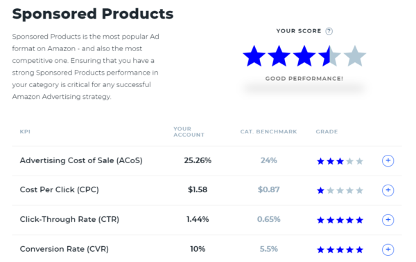
In this section, you’ll receive a score for your overall performance in your product category. The scores range from one star to five stars:
1 star = in bottom 20%
2 stars = in bottom 40 %
3 stars = between 40%-60%
4 stars = in top 40%
5 stars = in top 20%.
Click on the “+” button next to each KPI grade to do a deep dive. A section will appear that shows your account’s score compared to the category benchmark. Beneath that, you will see an ASIN-level analysis of your products.
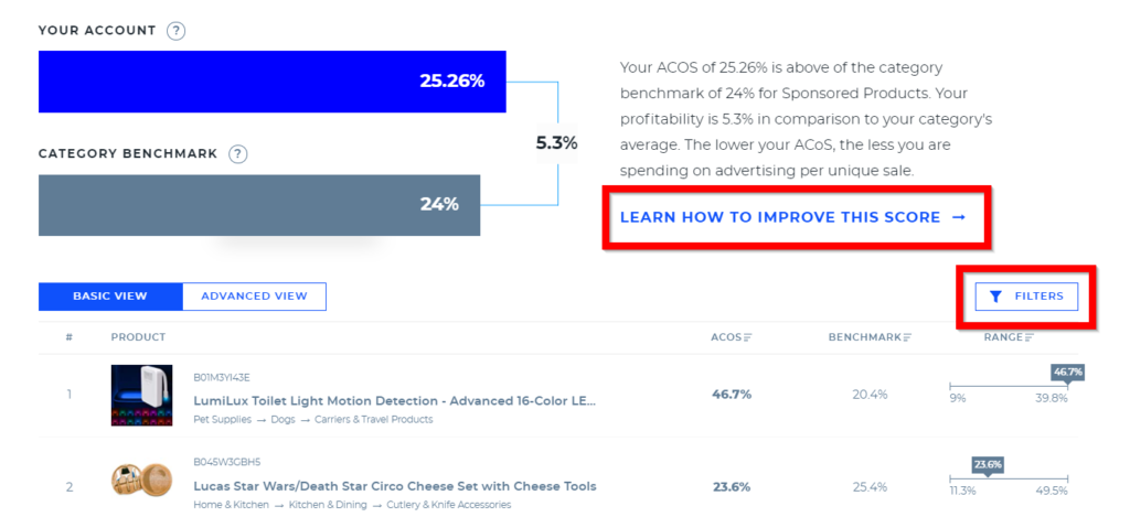
The column “Range” illustrates how each ASIN compares to other ASINs in the same subcategory.
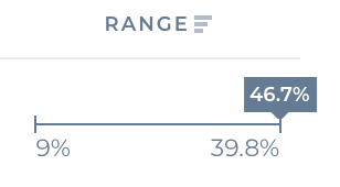
Taking the first product as an example, “LumiLux Toilet Light,” the figure on the left end of the distribution (in this example 9%) means 20% of the advertisers in this subcategory have a score lower than 9%. Similarly, the figure on the right (for the first product, 39.8%) means 20% of advertisers in this subcategory have a score higher than 39.8%.
The number above the distribution in the gray box is the ACoS for the displayed ASIN. In the example above, we can see that the first product, “LumiLux Toilet Light,” has an ACoS of 46.7%, meaning that it is in the top 20% for this subcategory. Products with an ACoS higher than the benchmark are prime candidates for optimization.
To interpret and take action on the ASIN-level KPI scores, repeat these steps for each KPI:
Use the “FILTERS” button above the far-right column to filter by ad spend.
Click on the KPI in the second column to easily sort scores to identify high-impact opportunities for optimization.
Implement solutions outlined in the “LEARN HOW TO IMPROVE THIS SCORE” link to improve your KPIs.
The Benchmarker - Executive Summary
Busy? Find a summary of the top 3 things to do with the benchmarker on 1 page here!
FAQs
How do I know if I’m eligible for a Benchmarker report?
If you’re actively using Amazon Advertising, you’re eligible! By actively, we mean at least 50 clicks in the past 30 days.
How can I get access to my customized Amazon PPC Benchmarker report?
Start here and follow the prompts. If you have any questions, contact us.
I already have Sellics - can I still get a Benchmarker report?
Absolutely, we encourage it! The Benchmarker can highlight product-specific growth potential and show you how to make the most of Sellics software.
To get started, request a report, or contact our customer service team for assistance.
A heads-up that because the Benchmarker and the Sellics tool run on different data infrastructures, we can’t run the report directly from your Sellics account - and will need your authorization to integrate: simply follow the prompts to get your report.
If you have multiple accounts, the Benchmarker will attempt to integrate to the one which you’re currently logged into. To choose a different account, log out and log back in before making your request.
How accurate are the benchmarks that power the Benchmarker?
The short answer: very.
The long answer: The Benchmarker data is based on aggregated and anonymized Amazon PPC data representing $2.5 billion in ad revenue across 170,000 products and 20,000 product categories.
All of the benchmarks that you see in the Benchmarker are screened for statistical significance and biases to ensure accuracy.
Finally, to avoid muddying the waters with unreliable averages—which can be skewed by outliers—we use medians by percentile instead.
Where do the benchmarks come from?
The benchmarks are based on an internal Sellics study involving $2.5B in anonymized and aggregated Amazon PPC ad revenue across 170,000 products and 20,000 product categories.
We’re proud that the Benchmarker has the most accurate benchmarks in the industry.
What improvements have been made to the Benchmarker?
While we’re constantly making improvements to the Benchmarker, we’re especially proud of our Q1 launches, when we added 20,000 sub-category benchmarks and a top 100 ASIN deep dive - a performance table that shows you where your greatest strengths and weaknesses are specific to each product.
Most recently, we launched some truly game-changing new features we think you’ll really like:
A performance score that assesses your overall Amazon PPC performance and potential.
An illustrated performance funnel infographic that shows all of your Amazon PPC KPIs in one place.
A month-over-month progress report - beginning with your second monthly Benchmarker report.
Not just insights, but actionable ones: inside your report, we’ll give concrete examples on how to optimize immediately, like how to improve your ACoS, CPC, click-through rate, and conversion rate.
We have many more improvements which are already underway, so stay tuned!
When will I get my next report?
You will receive a new report every month, on the same day you requested your original report. Every new report will incorporate data from the previous calendar month.
For example: if you requested your first report on April 6th, you will receive your next report on May 6th—showing data from the month of April.
Tip: If you want to get your report on the 1st day of the month, just request another report for your account on this date to set a new schedule.
What are the account structure benchmarks based on?
The account structure benchmarks are based on a combination of aggregated data and Sellics’ strategic recommendations. We believe account setup is at the heart of a successful Amazon PPC account.
To learn more about setting up your account for success, check out the following strategic blueprints:
Where can I share my feedback about the Benchmarker?
Join the Benchmarker closed community on Facebook now. There, you’ll have a chance to share your experience, ask questions, and offer suggestions for future iterations.
Plus, get exclusive access to helpful content and a chance to ask questions to advertising expert and Sellics CMO Thomas Ropel.
How do I know I can trust Sellics with my data?
Sellics holds itself to the industry’s highest standards of data privacy.
In summary of the fine print, we’ll never share any specific performance data of any of our clients or users to third parties: all benchmark calculations are based on anonymized and aggregated data.
The Benchmarker - Executive Summary
Busy? Find a summary of the top 3 things to do with the benchmarker on 1 page here!
To get started or learn more about how Perpetua can help you scale your Amazon Advertising business, contact us at hello@perpetua.io